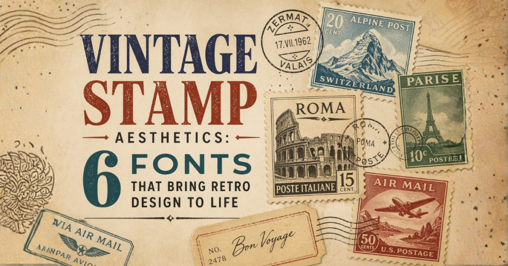
Postage stamp–inspired layouts are interesting to work with because everything happens in a very limited space. You don’t have the freedom of a full poster or a large web layout, every element has to fit neatly inside a small frame. That includes the illustration, the text, and even the spacing between them.
Because of this, typography becomes more than just a visual choice. It starts doing multiple jobs at once. A font might need to act as a headline, separate sections, support the artwork, and still remain readable at a small size. If the font choice is off, the whole layout can feel cluttered or unbalanced very quickly.
In the designs you’re working with, the fonts aren’t used randomly. Each one has a clear role, some handle strong titles, some support smaller details, and others add variation so everything doesn’t look the same across different stamps. The idea is not to use many fonts, but to use them with purpose.
Font 1: Microgramma
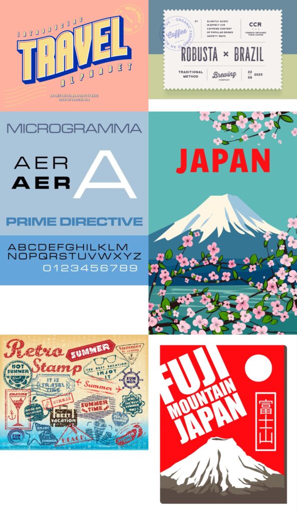
Where it fits: Titles like location names or main labels.
Microgramma is a geometric sans-serif with wide, structured letterforms. In stamp layouts, it helps create a clear and stable headline.
What it does in your design:
- Keeps titles readable even at small sizes
- Works well with landscape illustrations
- Adds a slightly modern tone without breaking the vintage feel
Font 2: Bookmania
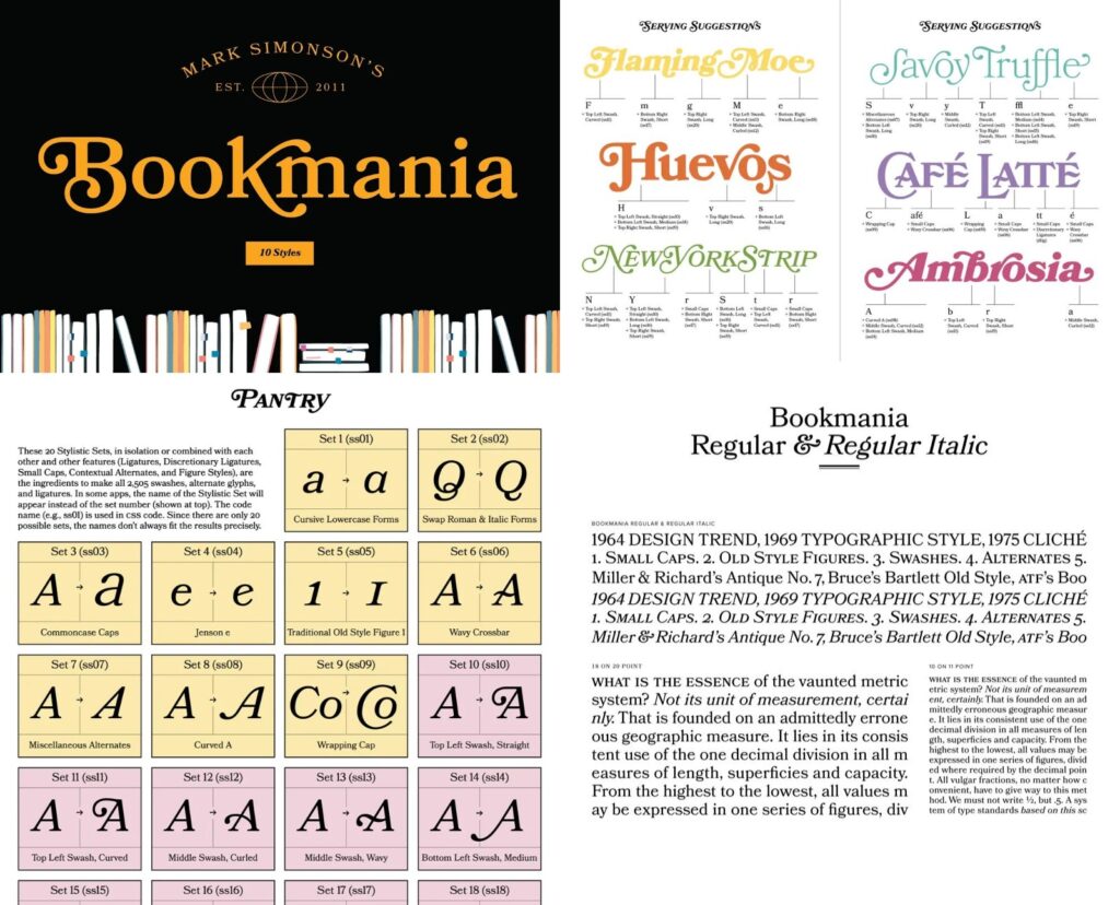
Where it fits: Descriptive or expressive text.
Bookmania is a serif font with noticeable contrast between thick and thin strokes. It’s useful when the design needs a softer or more narrative tone.
What it does in your design:
- Supports storytelling-style text
- Adds variation against bold headlines
- Works well in quieter, illustration-focused stamps
Font 3: Helvetica Neue
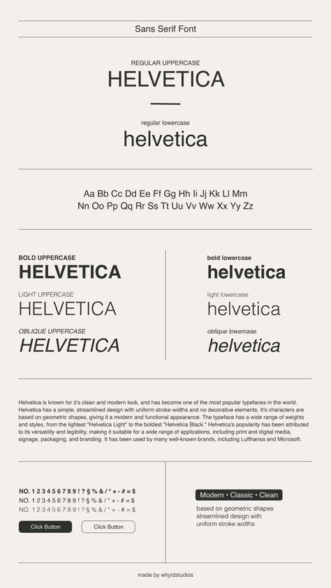
Where it fits: Supporting text, captions, and small details.
Helvetica Neue is neutral and highly readable. In detailed compositions, it prevents the layout from feeling crowded.
What it does in your design:
- Keeps smaller text legible
- Balances decorative fonts
- Maintains consistency across different stamps
Font 4: ITC Serif Gothic
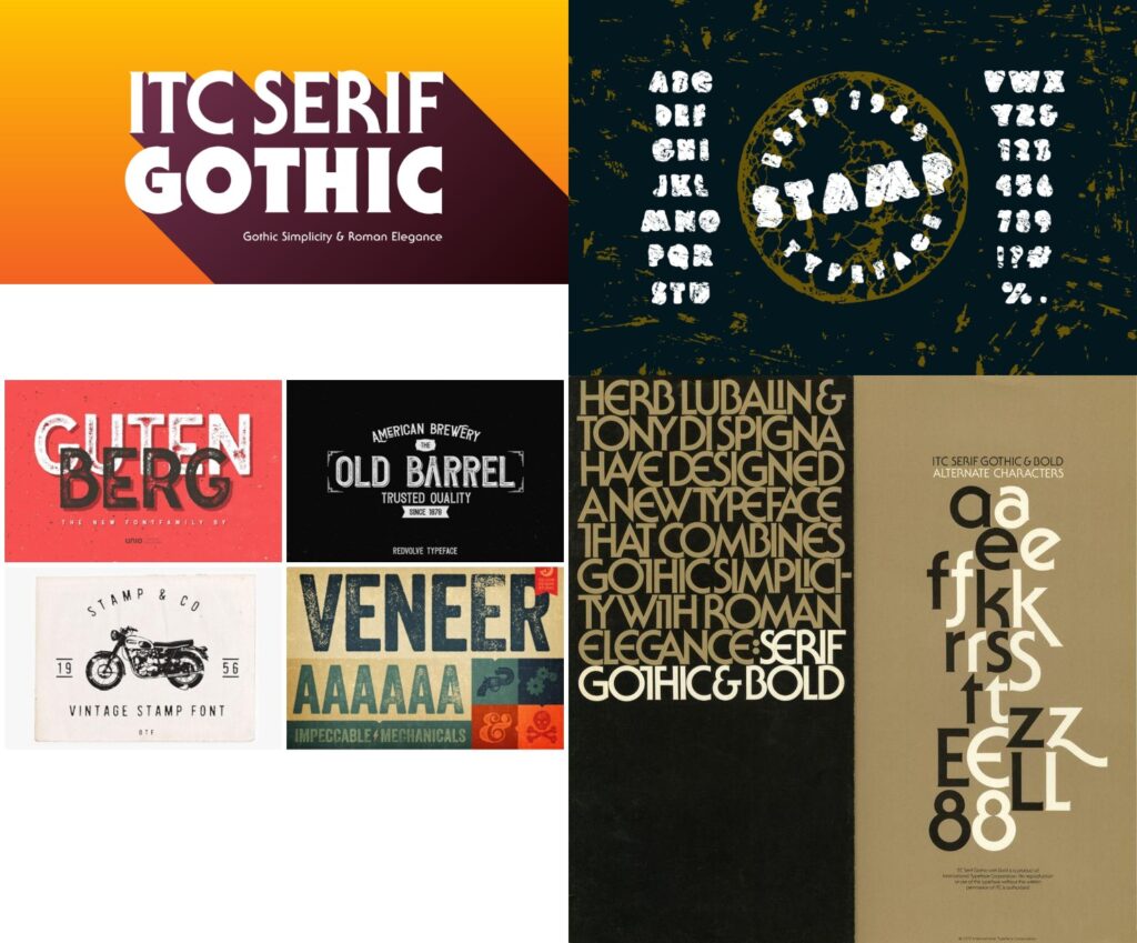
Where it fits: Section titles or secondary headings.
This font sits between serif and sans-serif styles. It has a distinctive look without being overly decorative.
What it does in your design:
- Adds character to headings
- Differentiates sections without overpowering visuals
- Works well in travel or location-based stamps
Font 5: Benguiat Pro ITC
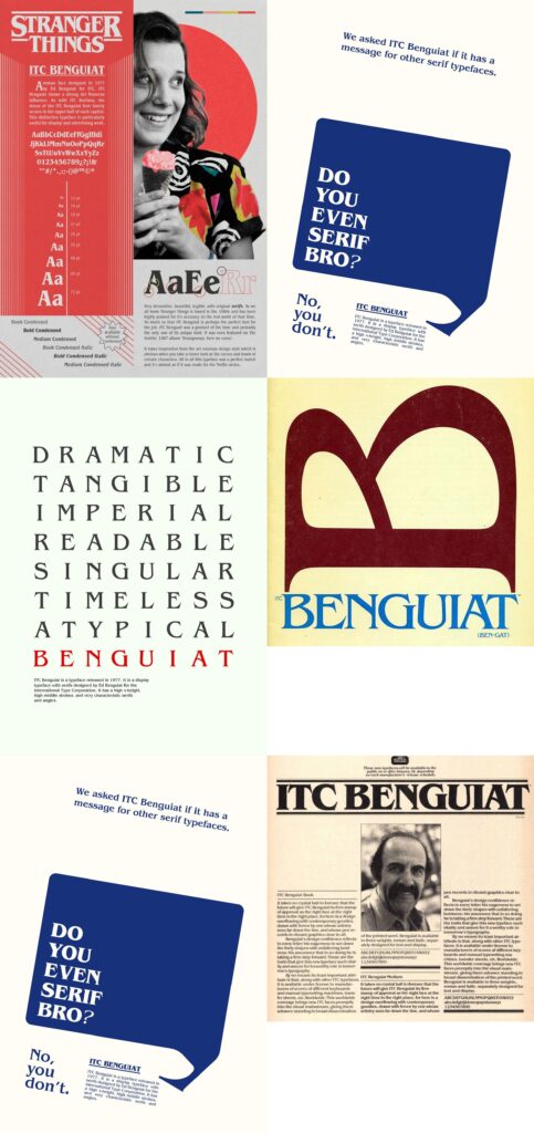
Where it fits: Feature titles or themed stamps.
Benguiat is a decorative serif with a strong identity. It’s useful when a design needs emphasis or a slightly dramatic tone.
What it does in your design:
- Draws attention to key titles
- Works well in themed or narrative stamps
- Adds visual contrast to simpler fonts
Font 6: Trigble 3D
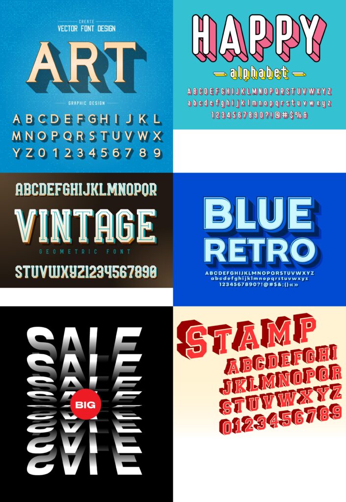
Where it fits: Highlight words or graphic text elements.
This style introduces depth and weight, which contrasts with flat illustrations.
What it does in your design:
- Creates a focal point
- Adds variation across stamps
- Works best when used sparingly
How These Fonts Work Together
In your stamp-style layouts, the combination follows a clear structure:
| Usage | Recommended Font |
|---|---|
| Primary title | Microgramma or Benguiat |
| Secondary heading | ITC Serif Gothic |
| Body or small text | Helvetica Neue |
| Expressive text | Bookmania |
| Highlight elements | Trigble 3D |
This approach ensures:
Final Note
The effectiveness of these designs comes from restraint and placement, not just font choice. Each font is used with a specific purpose—either to guide the viewer, support the artwork, or create emphasis.
When working with a similar style, it helps to think in terms of roles:
Answering these questions makes font selection much easier and keeps the overall design cohesive.