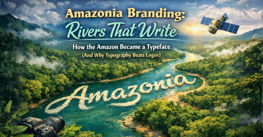
I’m calling it: Amazonia might be the best branding we’ll see this year – beautiful, pure art and full of essence ”
That’s the excited reaction from a Brazilian designer celebrating a groundbreaking project from his home country. And it’s hard to disagree.
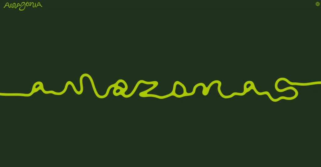
In April 2026, the Brazilian Amazon gained its first unified official brand: Amazonia. Created by FutureBrand São Paulo in partnership with RAI (Integrated Amazon Routes) and Embratur, this isn’t just another destination logo. It’s a living typeface literally shaped by the Amazon River itself.
This project turns geography into typography, satellite data into design, and nature into the ultimate creative director.
The Story Behind Amazonia: A Typeface Written by Rivers
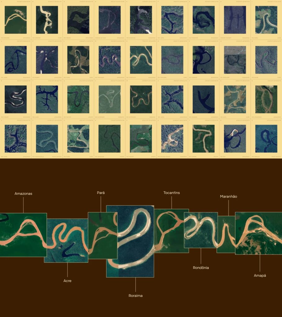
The Brazilian Legal Amazon spans nine states and covers an area larger than India. For years, tourism and local products from these regions were promoted with fragmented visual identities. The new Amazonia brand finally unifies them while respecting their rich cultural diversity.
Here are the fun facts that make this project so special:
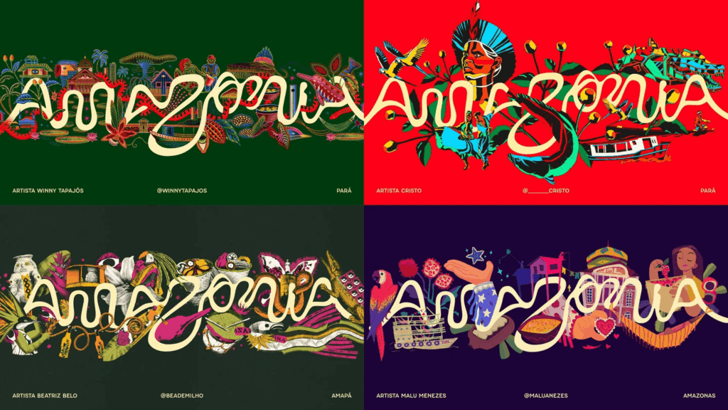
The full brand system also includes vibrant colors, flexible patterns, local illustrations, photography, and the “Feito de Amazônia” seal that certifies authentic local products. The goal is to boost sustainable tourism, support the bioeconomy, generate income for communities, and raise global awareness for rainforest preservation.
Why This Works So Well: You Don’t Need a Logo – You Need a Better Font
Most brands rush straight to designing a flashy logo and overlook the most important foundation: typography.
The Amazonia project proves how powerful a well-crafted typeface can be. It doesn’t just look beautiful – it carries the entire essence of the Amazon.
Here’s what most people get wrong when building a brand:
Instead, follow this smarter approach:
Some of the world’s strongest brands began with nothing more than excellent typography.
Your logo doesn’t need to be overly complex.
It needs to be recognizable – and a distinctive, meaningful font gets you there faster and more effectively.
Amazonia is a masterclass in this principle. The river-shaped letters don’t just look good; they feel like the Amazon. That emotional connection is what separates good branding from unforgettable branding.
For General Audiences: What NASA Is Doing with Satellite Images
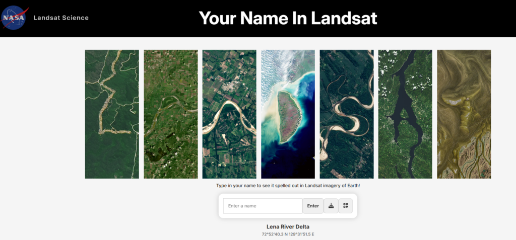
While the Amazon team turned earthly river geography into letters, NASA took a similar idea into space.
NASA offers a free online tool called “Your Name in Landsat.” Anyone can type their name (or any word) and instantly see it recreated using real satellite imagery captured by the Landsat program over decades. The letters are formed from actual photos of Earth’s surface – forests, coastlines, cities, mountains, and more.
It’s fun, instantly shareable, and surprisingly educational. In just seconds, you can see your name “written” across the planet from orbit. The tool also helps everyday people understand how satellites continuously monitor our changing Earth – from tracking deforestation and agriculture to observing natural disasters.
Both Amazonia and NASA’s tool show the same inspiring idea: vast scientific data (whether river coordinates or satellite photos) can be transformed into something personal, artistic, and deeply meaningful.
Key Lessons for Designers and Brand Builders in 2026
Final Thoughts
In a world filled with generic logos and forgettable fonts, Amazonia stands out because it feels truly alive. The Amazon River didn’t just inspire the brand – it literally wrote every letter.
As one excited designer put it: “beautiful, pure art and full of essence.”
Next time you’re building a brand, remember this simple truth:
You don’t need a complicated logo.
You need a better font.
And sometimes, the best font is the one nature has already designed for you.