What is responsive web designing?
Responsive web designing involves creating websites that adjust to different screens and devices, ensuring optimal layout and user experience on desktops, laptops, tablets, and smartphones.


Delivering a seamless and engaging user experience across all devices, responsive web design is crucial for businesses of all sizes. As a cornerstone of modern digital strategy, it ensures that your website is accessible and visually appealing, whether viewed on a smartphone, tablet, or desktop computer.
Number of website’s built
Increase in conversions after MindBees SEO & Digital Marketing strategy
Designers working with our team
Satisfaction rate, check out our customer reviews

We start with mobile and scale up, ensuring your website looks great and performs smoothly on any device.

Our designs use flexible grid systems that adapt flawlessly to every screen resolution and orientation.

We test and optimize for Chrome, Safari, Firefox, and Edge so your users always get the same high-quality experience.

We optimize buttons, menus, and interactions to be user-friendly on tablets and smartphones.

We compress assets and streamline code to make responsive pages load quickly - even on slower connections.

Your site remains visually cohesive across devices, providing a uniform user experience

We begin by identifying your target audience, understanding their devices and usage patterns. This helps us prioritize key features and content essential for them.
Our design team creates detailed wireframes for various screen sizes. This outlines the layout, including key elements like navigation menus, headers, and footers.
We prioritize important content for visibility on smaller screens. Using concise headlines and bullet points, we ensure information is easily scannable.
We design initially for the smallest screens, emphasizing essential content and functionality. Gradually, we enhance the design for larger screens.
Utilizing a flexible grid system, our developers implement CSS media queries to adjust styles for different screen breakpoints seamlessly.
We add images that automatically resize based on screen dimensions and resolution, preventing them from exceeding their container's width.
By optimizing navigation for smaller screens, we incorporate features like collapsible (hamburger) menus to ensure easy access.
Interactive elements, such as buttons, are designed with touch in mind, ensuring they are large and well-spaced for finger navigation.


Responsive web designing involves creating websites that adjust to different screens and devices, ensuring optimal layout and user experience on desktops, laptops, tablets, and smartphones.
With the shift toward mobile internet usage, a responsive design is key for consistent navigation and interaction across devices, improving user satisfaction and search rankings.
It uses flexible grids, CSS media queries, and responsive images to adjust the layout and style based on device specifications, ensuring seamless adaptation.
Benefits include enhanced user experience, broader reach to audiences, improved SEO, easier maintenance, and adaptability to future devices.
Adapting complex layouts for small screens, ensuring thorough cross-device testing, increased development time, and potential simplification of design elements.
By providing a user-friendly experience, it attracts more visitors, boosts engagement, and increases conversion rates, ultimately enhancing business growth.
Current trends include the focus on mobile-first design, the use of responsive typography, and integrating design thinking for interactive user experiences.


Trusted by 50+ clients for reliable WordPress support.
"We chose MindBees based on their experience with web host design and WHMCS templates; and have had our expectations not only met but exceeded. MindBees have delivered a great design at a good price. The MindBees development team has been responsive throughout the project, with all queries and change requests handled promptly; and any queries after project completion have been answered and help provided where needed to put the site live. Working with MindBees has been an easy and professional experience, highly recommended!"

"I am very impressed with MindBees, creative designs and their professional services. I love their customer service I get every time I call and I can not find one thing about this company that I do not love. If you are looking highly professional web design or development service then i strongly recommend you to go with MindBees."

"Mindbees has been of great help to our company. We have worked conjointly for many years now. They are a great partner and we have accomplished great endeavours alongside them. I would recommend them without hesitation."

"We had been in quest of a website designer for several months, but the few ones I got in touch with never seemed able to meet our taste. Finally, when I discovered Mindbees through WebHostingTalk, it appeared likely that such a passionate company"

"Hi everybody, I can say only good things about MindBees. The development team and the customer service has been second to none; I call them my ANGELS because they have been able to assist my works with precision and quickly, everytime helping me customize the themes and create something quite special. MindBees is a very good partner to satisfy my customers."
"We were very impressed with MindBees and their talented team with the results of our web design. It was done surprisingly quickly at unbeatable rates. We are glad we’ve made the right decision."
"As a hosting provider company we wanted a clean and simple website that is pleasing on the eye, easy to use and something that would stand-out from all the template based hosting websites out there. MindBees did an awesome job of custom designing our website! We find their entire team to be highly competent, very professional to deal with and they provide a top-notch support and response when needed."
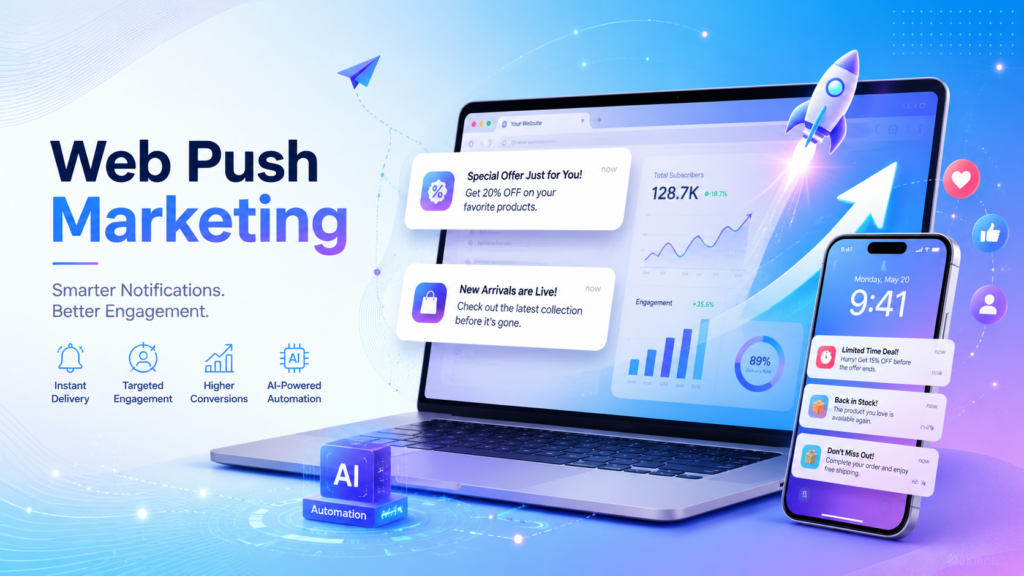
The evolution of digital marketing is happening at a fast pace. This is causing marketers to have trouble connecting directly with their customers. Social media algorithms keep restricting the reach of posts, and email inboxes have become increasingly cluttered. In...
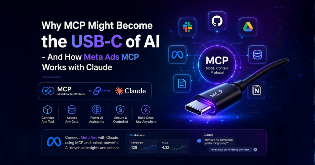
For a while, most AI tools worked like separate islands. You could use one AI assistant for writing, another for coding, and another for searching documents or answering questions. But the moment you wanted these systems to interact with real...