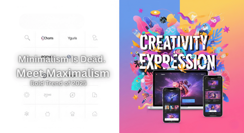
In the digital design world of 2025, the mantra “less is more” is starting to feel so last decade. Minimalist websites and branding – once the epitome of modern cool – are now everywhere, to the point that many look and feel the same. Scroll through your feeds or browse new brand logos, and you might catch yourself asking: where’s the personality? Enter maximalism, the “more is more” design rebellion that’s injecting color, character, and chaos (the good kind) back into our screens. From websites brimming with bold graphics to brand identities that practically shout their stories, maximalist design is the big, bold trend of 2025. In this post, we’ll explore why minimalism is losing its edge online, how maximalism is rising to take its place, and how you can embrace this trend in web design, branding, and beyond – without sacrificing usability or clarity. Let’s dive into the wild world of digital maximalism and how to make it work for you.
Why Minimalism is Losing Its Edge Online
For years, digital designers worshiped at the altar of minimalism. Clean layouts, lots of white space, simple everything. And yes, minimalist design brought us sleek, fast-loading websites and easy-to-navigate apps. But by 2025, we’re seeing signs that this once-fresh aesthetic has stagnated. Here’s why the minimalist look is starting to lose its online magic:
- The “Sea of Sameness”: So many brands jumped on the minimalist bandwagon that they’ve started to blend together. The trend of “blanding” – brands stripping logos and visuals down to basic sans-serifs and neutered colors – led to logos that are “flat, black, and generic,” looking “just like everything else”. While simplicity was meant to streamline, it often erased the quirks that made brands unique. As one creative director put it, there’s been a pressure to sacrifice personality for a universal, safe look. The result? A lot of digital experiences feel interchangeable and forgettable.
- Digital Fatigue: In an endless scroll of content, overly minimal designs can actually be easier to ignore. A sparse web page or a subdued ad might be too easy on the eyes – so easy that users swipe right past. Bold visuals, on the other hand, “disrupt the scroll and grab attention,” as 2025 web trends analysts note. Users today (especially Gen Z and Gen Alpha) are drawn to experiences that pop. After one too many all-white, text-only hero sections, audiences are craving something that surprises and delights them visually.
- Emotional Disconnect: Minimalism’s neutral, pared-down style can come off as impersonal. It’s no coincidence that in uncertain times, people gravitate towards designs that feel human and comforting. A sterile interface with just a couple of lines of text and a flat icon might be clear, but it doesn’t evoke much feeling. In contrast, maximalist design can make a website or brand feel like it has a soul and story. As one packaging expert remarked, years of ultra-minimalism have left many brands drained of emotion. Users want brands with character, and minimalism doesn’t always deliver on that front.
- Cycle of Trends: Of course, part of this shift is simply the design pendulum swinging back. We spent the 2010s and early 2020s inundated with minimalist everything, from ultra-simple websites to every tech company using a similar sans-serif logo. By 2025, designers are itching for the next big thing. Expressiveness, ornamentation, and nostalgia are creeping back in. Even some companies that once championed minimalism are reversing course (for example, luxury brand Burberry ditched its minimalist sans-serif logo and revived a more distinctive classic emblem, signaling a return of personality). Newcomer brands are also skipping the minimalist phase entirely – just look at Liquid Death’s bold gothic branding or the vibrant illustrations on Cash App’s site, which hint that the ultra-flat look for digital products may be on its way out.. All signs point to a collective moment of “we’ve seen enough plain white backgrounds – bring on the fun!”
In short, minimalism online isn’t dead per se (it still has its place), but it’s definitely losing its monopoly on “good design.” Users and brands alike are finding that being too minimal can mean fading into the background. And in response, a bold new contender is stepping into the spotlight.
Meet Maximalism: Design That Shows Personality
If minimalism whispered, maximalism shouts (in the friendliest way possible). So what exactly is maximalism in a digital design context? It’s an approach that says: why use one color when you could use ten? It’s the art of embracing excess to make a point. Think explosive color palettes, dramatic typography, layered visuals, ornate details, and an overall vibe of curated chaos. Maximalist design is “the art of ‘more is more’” – and after years of “less is more,” it feels like a breath of fresh air. Crucially, maximalism isn’t about making an ugly mess; it’s about infusing personality and storytelling into every pixel. “Maximalist design breaks through the noise of a minimalist-dominated market by creating rich, immersive experiences,” offering depth and complexity that invite viewers to engage more deeply. In other words, it gives viewers more to chew on.
A maximalist brand identity might layer symbols, patterns, and illustrations that allude to the brand’s history or values. A maximalist website might have interactive animations, bold blocks of color, and funky cursors that make browsing feel like an adventure. The goal is to delight and surprise, forging a stronger emotional connection. As one design expert put it, a maximalist approach can lead to designs that people lose themselves in – “a story within a story” that stands out against the bland backdrop of overly simple design. Why is maximalism gaining momentum now? A few reasons:
- Standing Out in the Crowd: With so much content out there, brands want to be unmissable. Maximalism, by its very nature, is hard to ignore. A splash of neon gradient and a collage of images is going to draw the eye more than yet another minimalist navy-blue-and-white layout.
- Personality-Driven Branding: In 2025, authenticity and character are big marketing buzzwords. Consumers (especially younger ones) gravitate towards brands that show some personality – quirks, humor, edginess, you name it. Maximalist design is a perfect vehicle for that because it gives you so many tools to express an identity loudly and clearly.
- A Creative Renaissance: Digital designers themselves are pushing maximalism because it lets them flex their creativity in ways minimalism didn’t. After years of obeying strict grids and limited palettes, designers are basically saying “heck yeah, let’s play!” There’s a sense of freedom in breaking the old rules.
- Resonating Emotionally: Maximalist designs often have a warmth or bold emotion to them – whether it’s nostalgia from retro patterns or excitement from bold color clashes. This resonates with users on a deeper level.
Maximalism thrives especially in industries and projects where telling a story or creating an experience is valued. Creative agencies, fashion brands, music and entertainment sites, and direct-to-consumer brands hungry for differentiation have been early adopters of this bold style. The bottom line: maximalism is design with the volume turned up – and a lot of brands are finding that 2025 is the perfect time to pump up the volume.
Digital Maximalism in Action (Logos, Websites, Packaging, etc.)
Maximalism isn’t just a theory – it’s making its mark across digital and visual design. Let’s look at how this trend is coming to life in various design mediums:
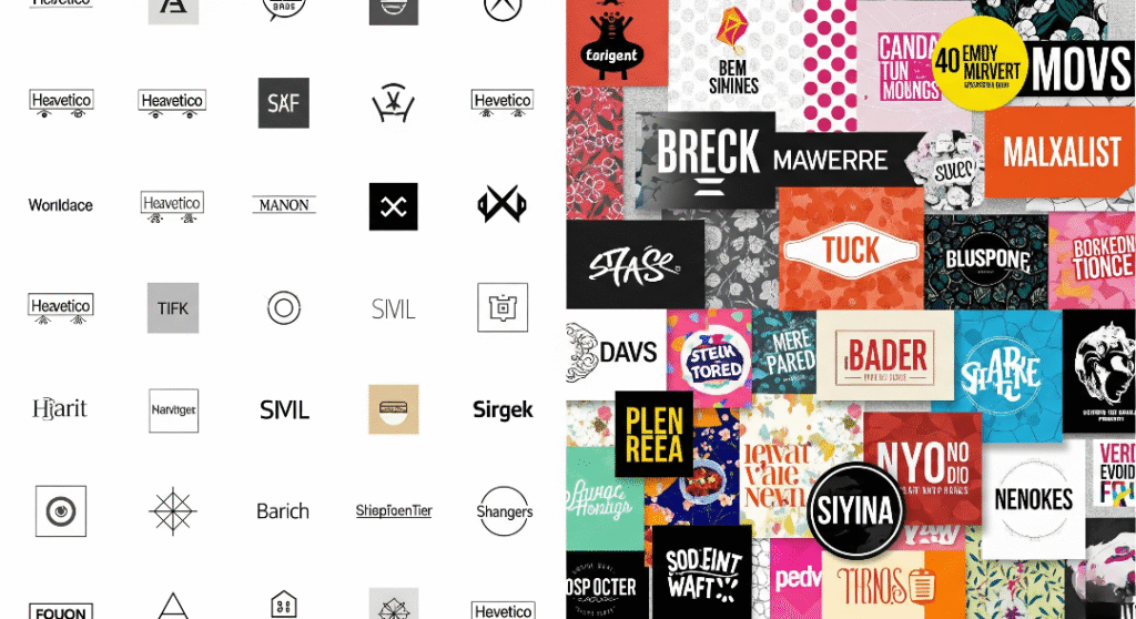
- Branding & Logos: We’re seeing logos and visual identities with more adornment, complexity, and color. Some brands have revived older, more ornate logos (e.g., Burberry’s iconic serif and knight emblem), while others are creating bold new logos like Liquid Death’s gothic text Marketing Brew. Even when logos remain simple, brands are expanding their identity systems with vibrant patterns and illustrations, as seen in Figma’s colorful rebrand.
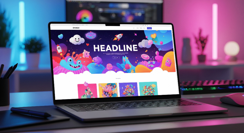
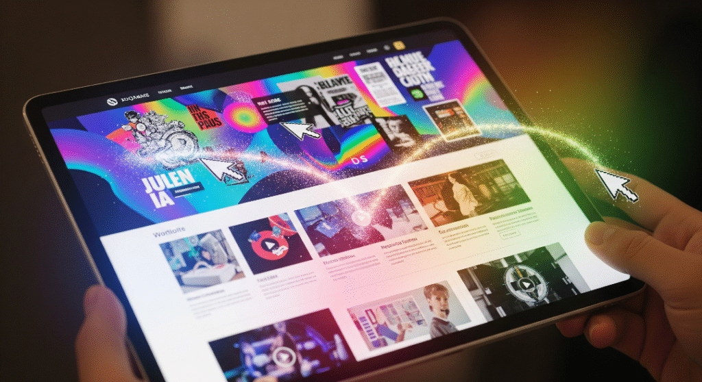
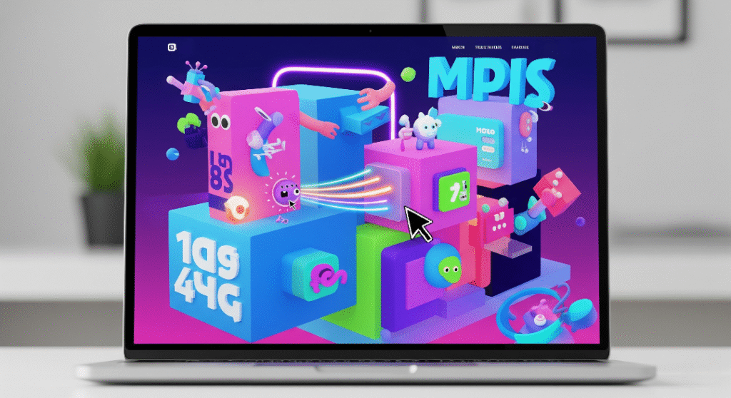
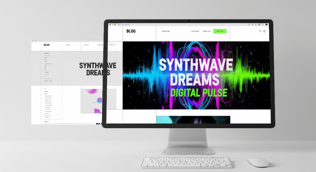
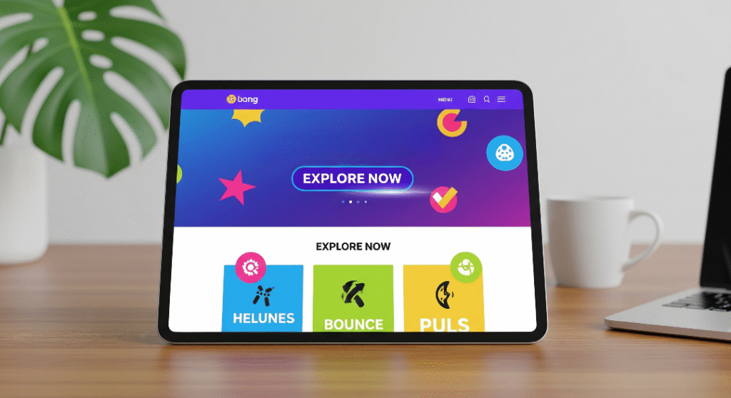
- Web & UI Design: Websites are the playground of maximalist design in 2025. Creative studios like Active Theory and Obys produce web projects with animations, unconventional navigation, and layered visuals. Think neon gradients, overlapping elements, and custom cursor effects that make browsing fun. The rise of faster browsers and advanced CSS/Canvas capabilities enables this visual richness without sacrificing performance.
- Packaging & Product Design: Maximalist packaging is hitting e-commerce and Instagram feeds hard, with vibrant, patterned designs that feel like collector’s items. Craft beverage cans and beauty product boxes are covered in bold illustrations and daring color combos, creating a cohesive brand experience across physical and digital touchpoints.
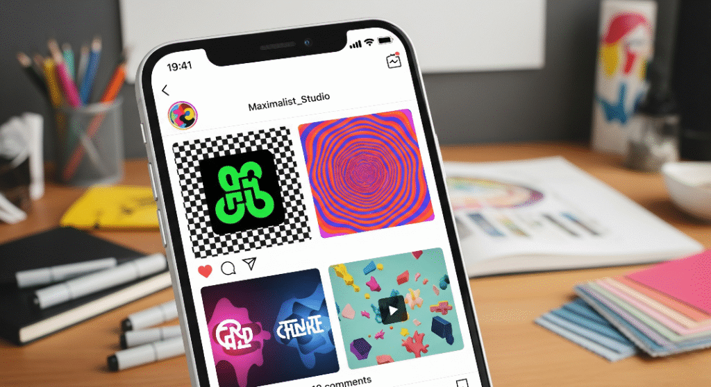
- Visual Content & Social Media: Instagram posts are getting louder with animated collages, colorful 3D renders, and “dopamine colors” that spark joy. Even AR/VR experiences lean maximalist, making virtual spaces fun and immersive.
The best maximalist designs balance excitement with usability, ensuring the chaos is curated and purposeful.
Blending the Best of Both Worlds
Despite the provocative title of this post, the reality isn’t a deathmatch between minimalism and maximalism. Many of the most effective designs in 2025 cleverly blend elements of both. Think of it like music: a quiet verse makes the loud chorus hit harder. Here are some ways designers are blending these styles:
- Maximalist Accents on a Minimal Base: Start with a minimalist framework (grid layout, clear navigation) and layer pops of maximalism, like a bold hero graphic or funky typography.
- Bold Entrances, Clean Exits: Use maximalism on landing pages to wow users, then switch to minimalism for inner pages or checkout processes where simplicity aids usability.
- Integrated Aesthetic: Combine minimalist structure with maximalist elements, like bold colors or quirky fonts in a clean layout, creating a “new minimalism” that’s both clear and vibrant.
The key is intent: pick and choose from both toolkits to craft an experience that fits your content and audience. It’s not a binary choice but a spectrum.
How to Apply Maximalism to Your Brand (Visual/UX Tips)
Ready to add maximalist spice to your brand’s website or visuals? Here are practical tips to do it effectively without sacrificing usability:
Keep Accessibility in Mind: Ensure color contrast, alt text, and keyboard navigability so everyone can enjoy your design, a priority in our product design process.
Balance Complexity with Usability: Ensure navigation remains intuitive despite visual complexity. Buttons and menus should be clear, and content logically organized, as we emphasize in our responsive website design services.
Be Intentional – Not Just Cluttered: Every element should serve the brand story, a principle central to our branding approach. Curate content thoughtfully to avoid randomness.
Use Color Strategically: Embrace bold palettes but ensure contrast for readability and alignment with brand identity, a key focus of our graphics design work. Check accessibility for text legibility.
Go Wild with Typography (within reason): Mix playful typefaces for headlines but keep body text readable. Limit fancy fonts to key areas, as we do in our logo designing projects.
Incorporate Interactive Elements Thoughtfully: Add animations and hover effects to engage users, but ensure they’re purposeful and don’t hinder functionality, a balance we achieve in responsive website design.
Optimize for Performance: Compress images, use modern formats (WebP/AVIF), and leverage lazy loading to keep sites fast despite heavy visuals.
Maximalism on the Feed: Instagram Pages to Watch
Instagram is a hotspot for maximalist design inspiration. Here are some accounts showcasing bold, modern visuals:
- @hoodzpahdesign: A California studio known for vibrant logos and custom typography with big personality Instagram.
- @studiomuti: Cape Town’s MUTI delivers bold illustrations and intricate branding, from murals to packaging Instagram.
- @madebysofa: Blends clean UI with maximalist twists like vibrant gradients and 3D icons.
- @ilovecreatives: A colorful mix of educational content and quirky, maximalist graphics with a pop-culture vibe.
- @velvetpanther: Curates moody, luxurious designs with rich colors and surreal details.
Check hashtags like #MaximalistDesign or #BoldBranding for more inspiration.
Conclusion
As we’ve navigated the bold trend of maximalism in 2025’s digital design landscape, one thing is clear: design is cyclical, but it’s also cumulative. We’re not throwing minimalism in the trash; we’re building on it, reacting to it, and fusing it with fresh ideas. Maximalism online represents a vivid rebellion against sameness, an invitation for brands to be more themselves and for users to feel something memorable. It’s about “the power not just to be seen, but to be remembered”. Whether you fully embrace “more is more” or just turn up the dial on your minimalist style, design with intention and integrity. Create a bold identity with our branding services, craft a standout emblem through logo designing, or bring vibrant visuals to life with graphics design. For a website that balances maximalist flair with usability, explore our responsive website design. Elevate your packaging with our product design expertise. The ultimate goal isn’t maximalism or minimalism; it’s a digital experience that’s both useful and inspiring. So go ahead: add that extra flair, experiment with that wild idea, and make your digital canvas sing. Minimalism had its time; now it’s maximalism’s turn to crank up the volume – and we’re here for it. Happy designing!